WalkMe Workstation
Enhancing employee productivity and engagement. Find information, and initiate workflows.
WalkMe Workstation centralizes employee tasks for increased efficiency. The platform integrates with a variety of tools, providing employees with enhanced convenience. on-the-go via a native mobile app and desktop app.
Role
Senior Product Designer
Platforms
IOS, Android, Desktop
Timeline
(Alpha stage)

Business goals
Value proposition

Two types of users
Employees with access to a computer in their daily work.
Deskless workers, Employees with no access to a computer in their daily work, such as delivery persons.
Problem Statement
While Walkme Workstation is a popular desktop tool, it lacks an excellent mobile counterpart. The challenge was to design a mobile app that reflected the simplicity and effectiveness of the desktop version while offering the convenience of on-the-go access.
User research
Information Architecture -
Open Card Sorting
To find significant issues with the current design, I ran an open card sorting with nine people from different backgrounds using Google Sheets.
I chose this method since I wanted to understand where users expect to see different features and options of the app.
I’ve created a short video that explains how to use the template and gather all results
Notable revelations
Very inconsistent groupings
Some users created an entire group for one item.
Survey and an open slack channel for feedback
I also conducted a user survey regarding current users' satisfaction and requests for future features.
This helped me understand pain points and what are the repeating requests.
Dozens of people responded.
there
Notable revelations:
Search is one of the most used feature
There are a lot of performance issues (Crashes and slow initialization
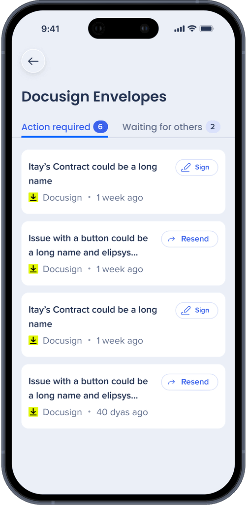
Salesforce integration was the number 1 request (Ticket statuses & more actions)
Key Findings
Users needed a quick and easy access to their tasks, messages, and project updates.
Users are looking for seamless integration with other tools they use at work.
Users found the app's interface cluttered and navigation confusing.
Many users felt that the app lacked personalization options.

Based on the findings, I approached my redesign in three steps:
Information architecture, Core features, and Visual design.
Sketches and idea validation


I sought feedback by creating many sketches, wireframes and running quick usability tests with random users.
Solution
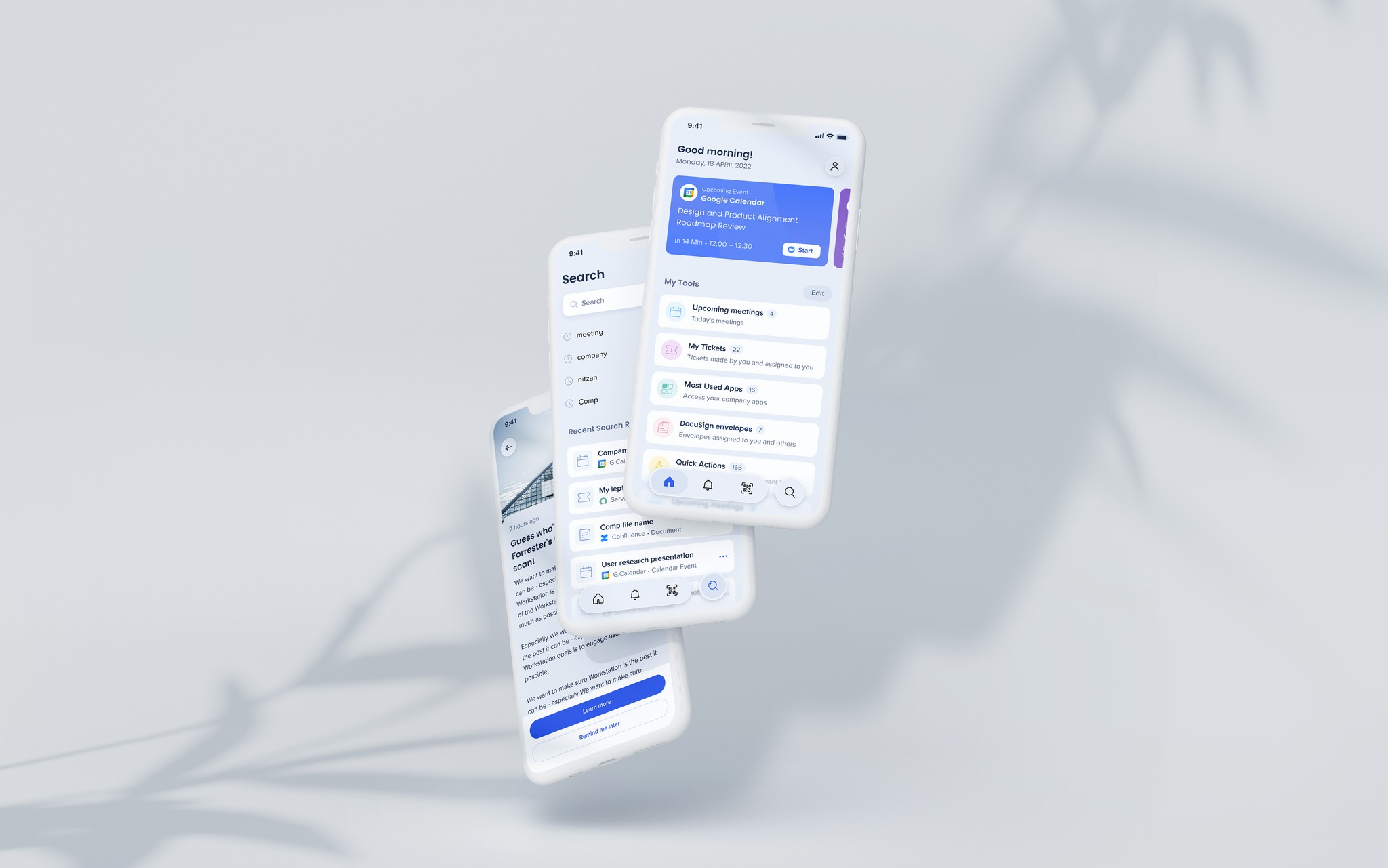
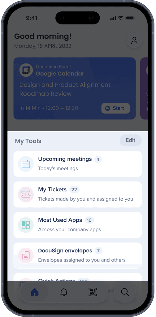
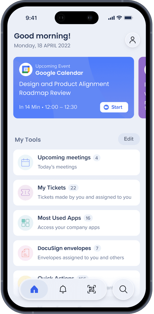
Personalized workspace
Every user might have a different Workflow.
Therefore I’ve created Homepage edit options so users can choose the order of widgets and whether to see it or not.
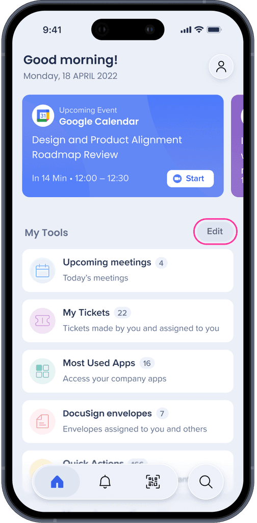
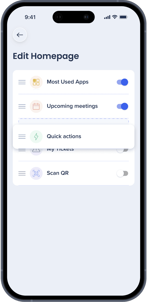
Area for highlights
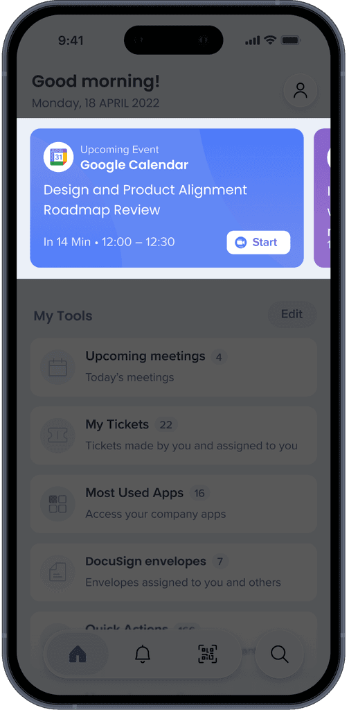
Overview at a glance
Testing the new design & Feedback
Users loved the simplicity of the design and found navigation intuitive.
The integration with other tools was highly appreciated.
Some users requested further customization options for task management.
Homepage
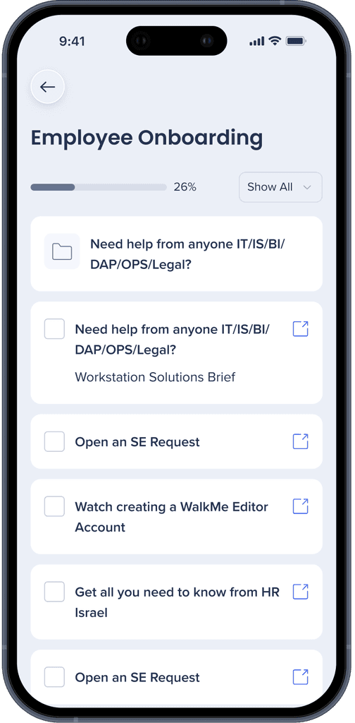
Internal page
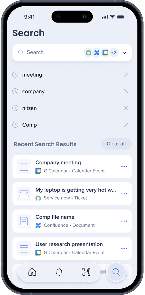
Search
Search
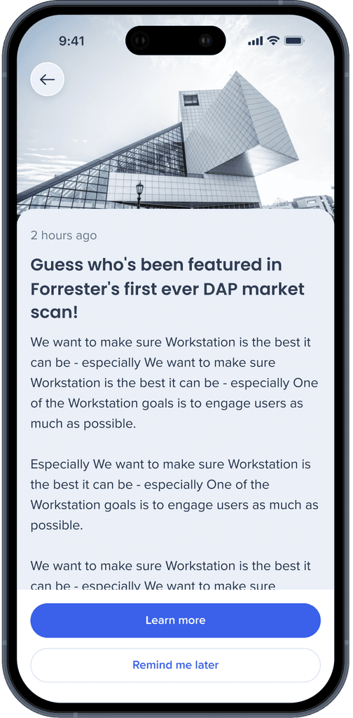
Article
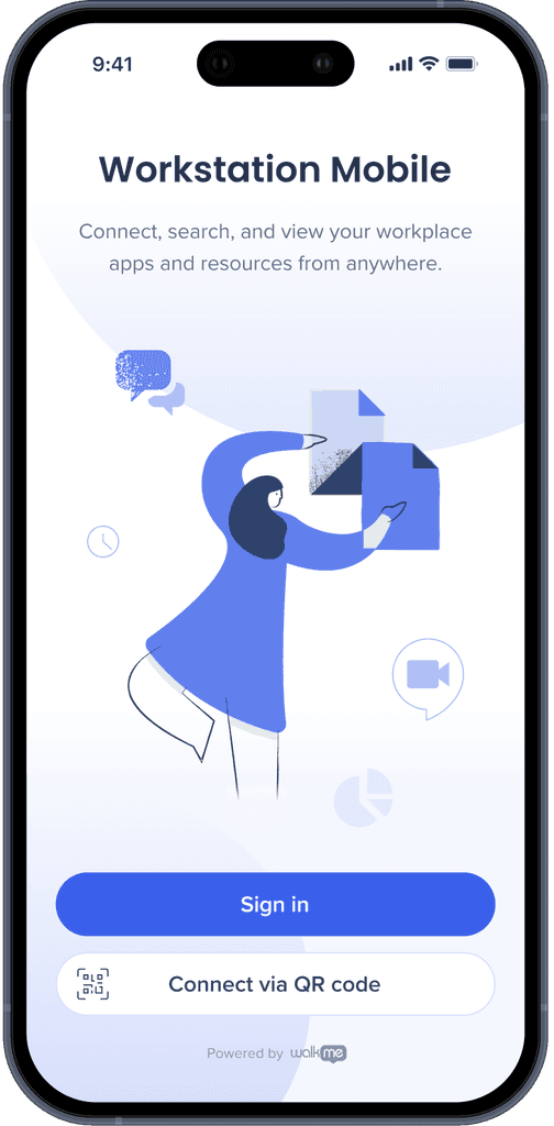
Sign-in
Accomplishments
Reflections
Early feedback
Internal users
Other research and impact I've made in Walkme
In addition, I developed an efficient internal research hub, curating and consolidating all user research conducted within the company.