
monday.com
Scaling Templates for Enterprise Use
In theory, templates were a powerful way to replicate success across teams. In practice, users were confused about what a template was, how to save one, and where to find it later. Templates were buried in workspace menus, indistinguishable from live content, and impossible to update at scale.
I led the redesign of Monday’s templates system to make it discoverable, scalable, and enterprise-ready. Working closely with our PM, UXR, and implementation teams, we rebuilt the experience to support both clarity and control — two key aspects that our largest customers relied on.
Role
Senior Product Designer
Team
PM, UXR, Analyst, IC
Platforms
Web
Timeline
6 weeks (Alpha stage)
The problem
- Templates and live workspaces were mixed, creating confusion
- Poor discoverability and lack of clear flow for using or sharing templates
- No way to save boards as reusable parent templates
1. Unclear hierarchy between templates and live workspaces
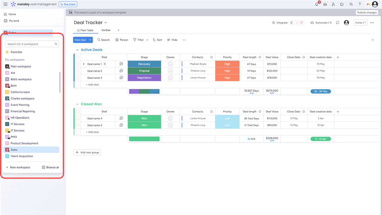
Before:
Templates were mixed with everyday boards, making it hard to distinguish reusable structures from active work.
After:
I redesigned the system so templates now live exclusively in a dedicated Template Center — a central hub to browse, manage, and share templates, clearly separated from workspaces and project boards.
Before
After
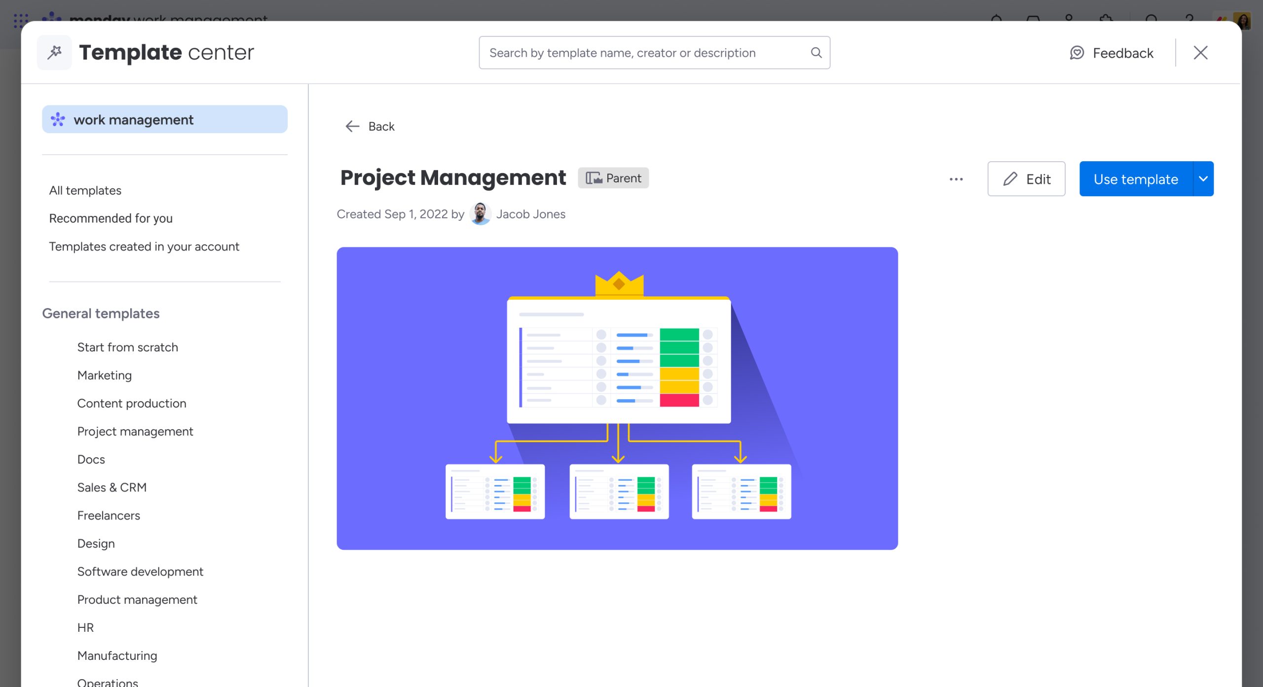
A central place to find, edit, and reuse templates. Previously, they were buried in workspace sidebars.
2. Discoverability and flow issues
Many users didn’t know they could use templates — and those who did couldn’t easily share or edit them. There was no guided entry point into the experience.
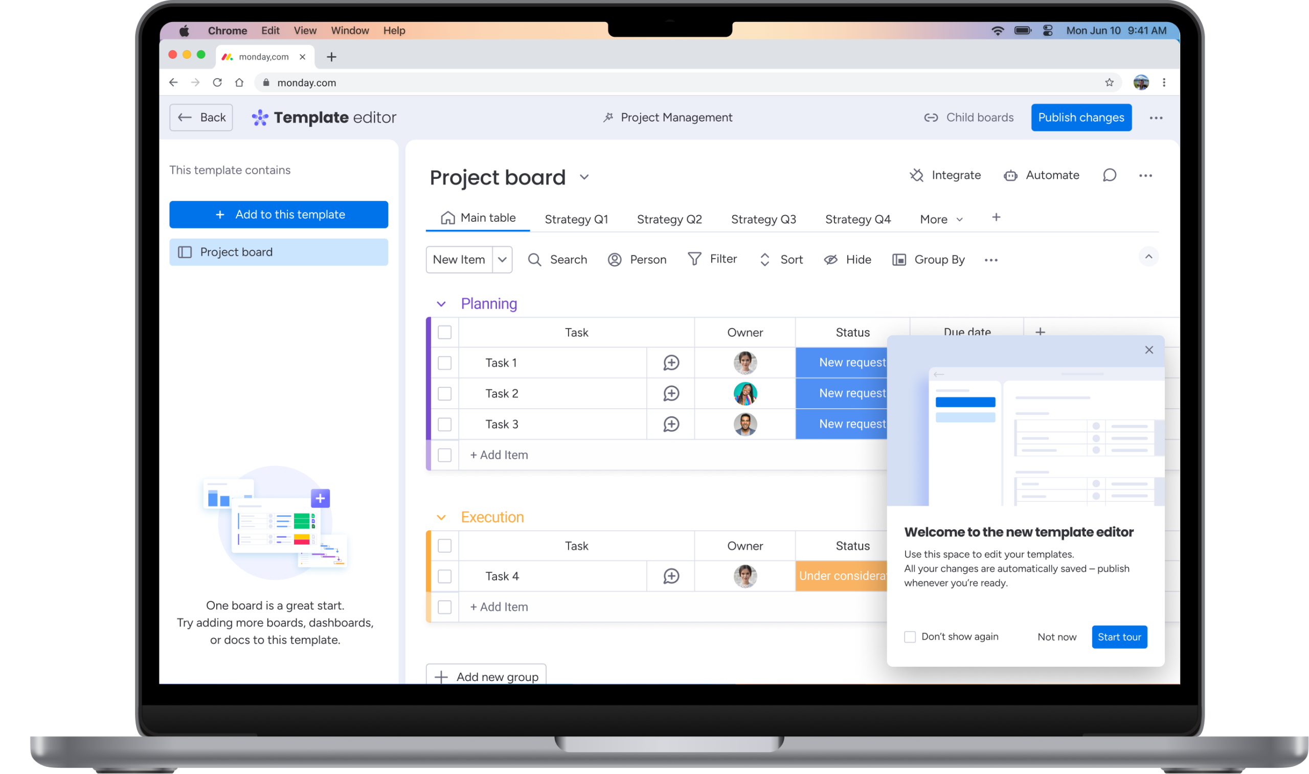
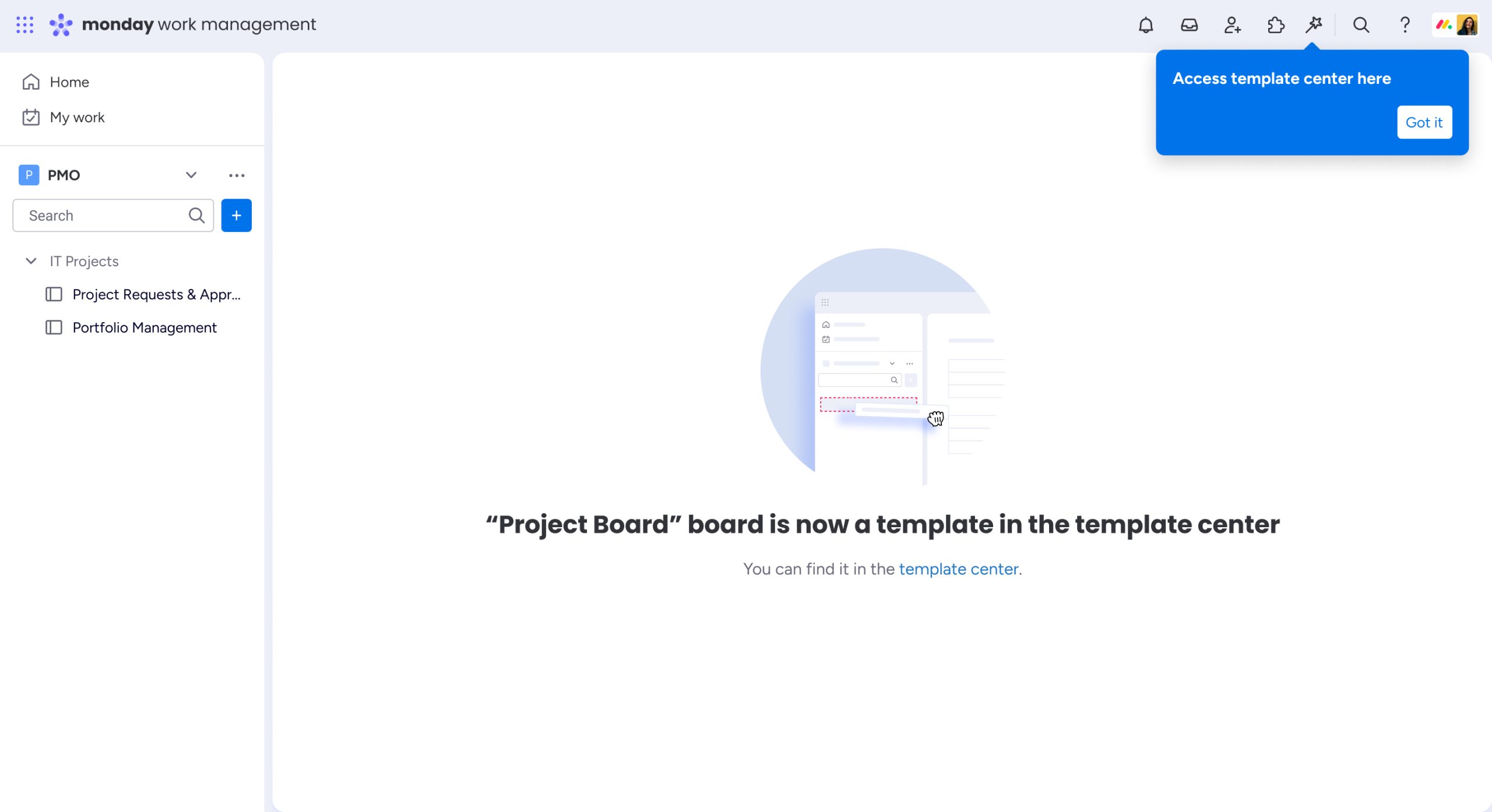
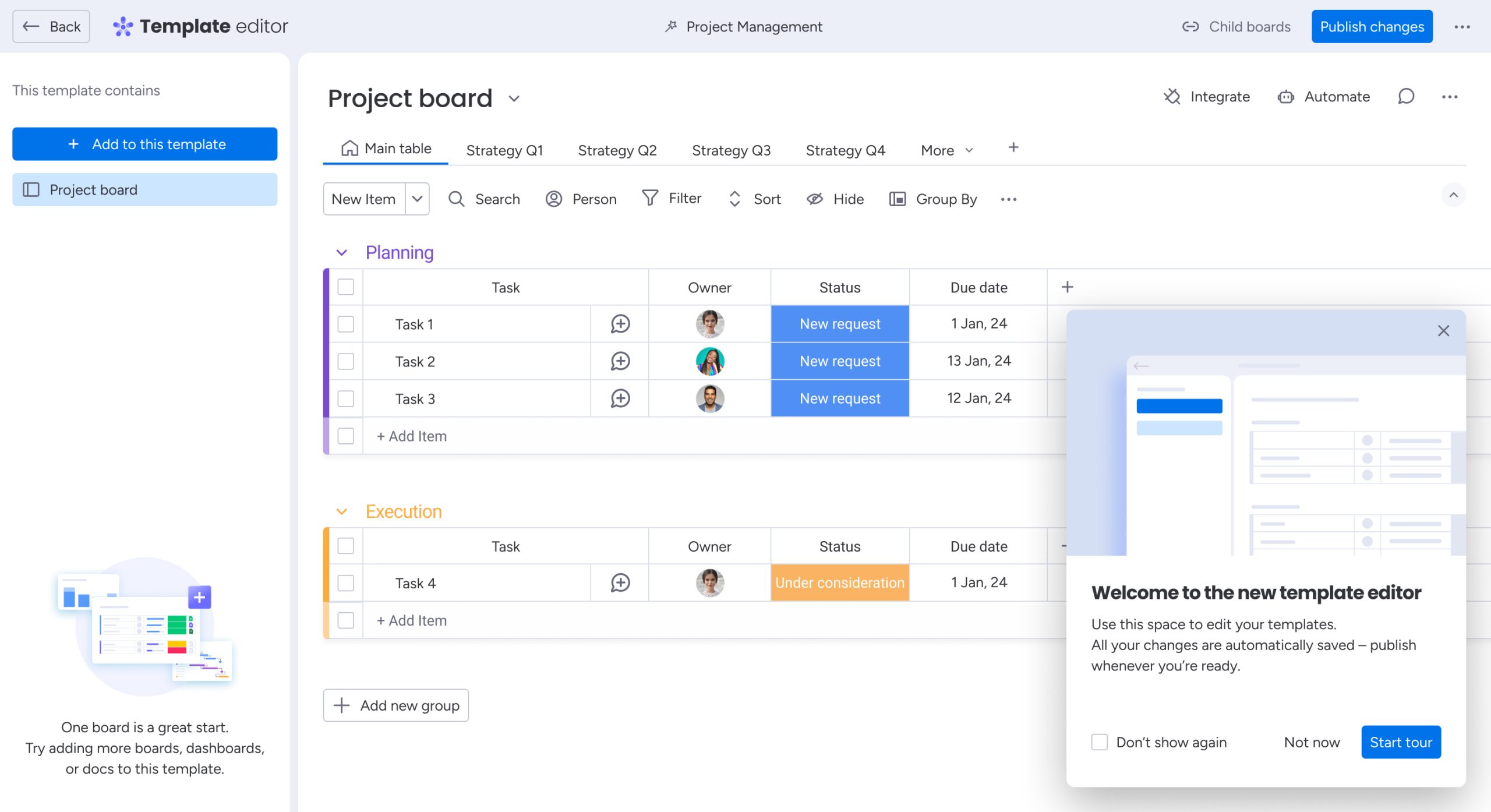
I introduced progressive onboarding, using empty states and contextual onboarding modal to guide users as they interact with templates for the first time.
New entry to template center
Template editor onboarding
3. Users are expected to templatize individual boards
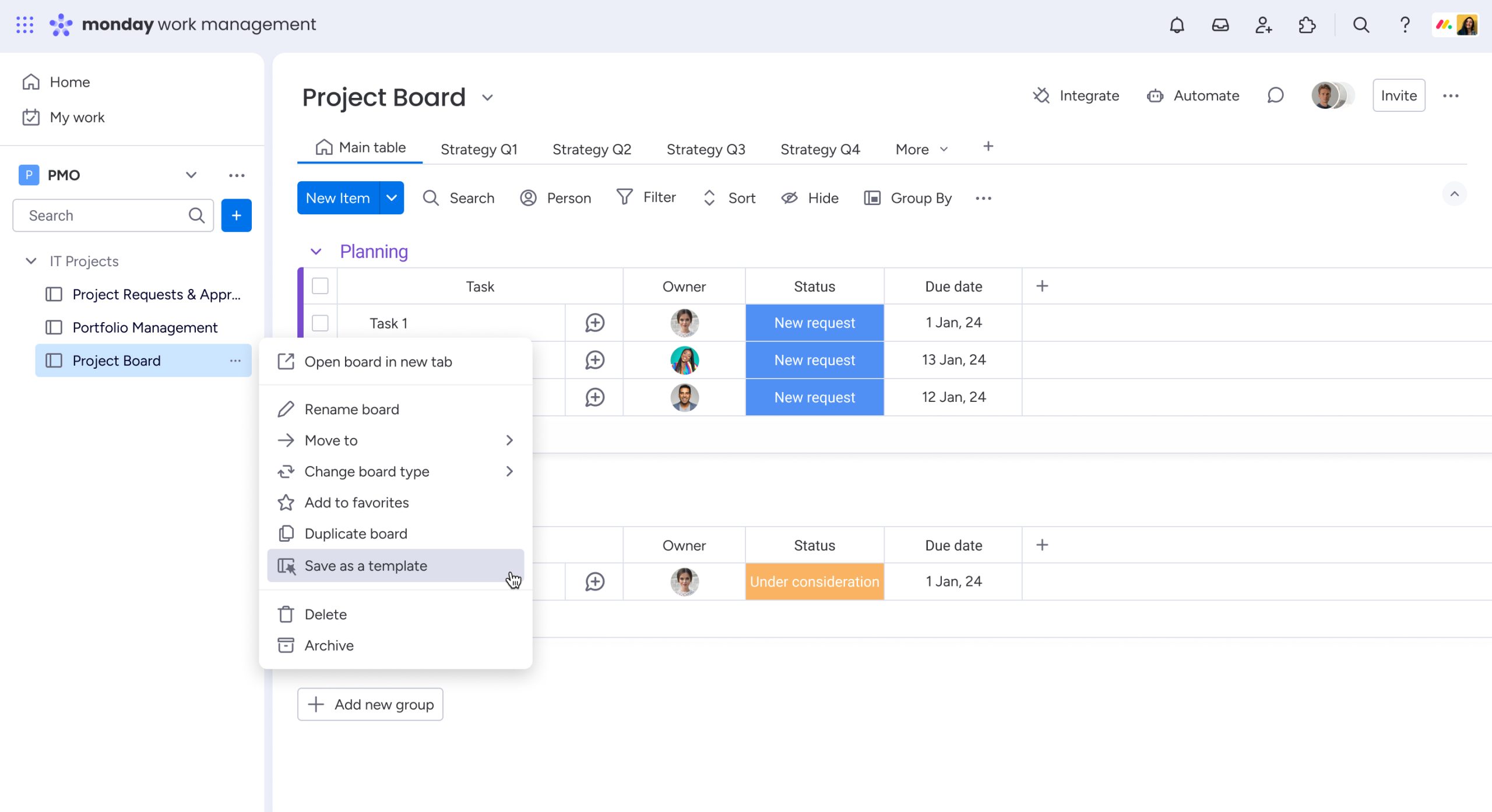
Until this project, users could only save an entire workspace as a parent template. But in reality, they expected to be able to templatize a single board — or choose just the pieces they needed.
To meet that expectation, I proposed a shift in thinking: everything should be templatizable. Whether it’s one board or many, users should have the flexibility to create templates that match their real workflows.
Save a board as template
Standard vs. Parent, visually guided.
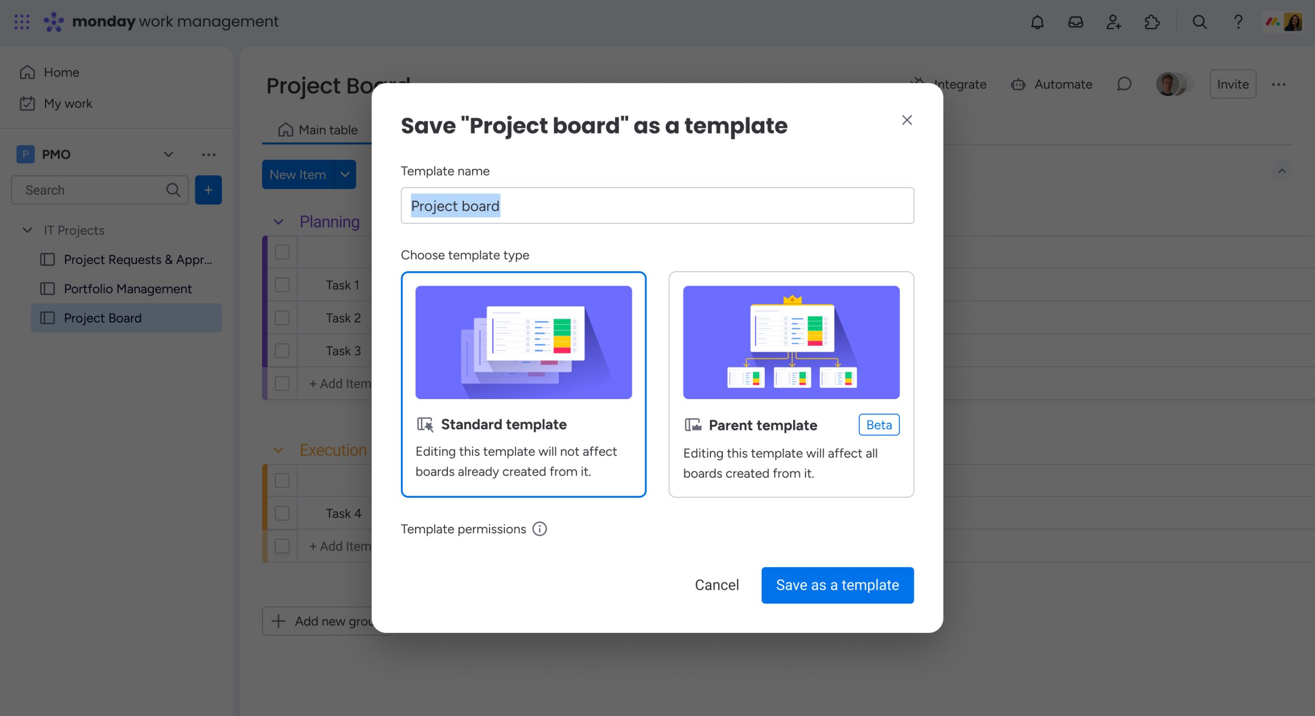
I collaborated with UXR to test the terminology and structure. Users quickly understood the new logic, and we saw a measurable improvement in task completion and confidence.
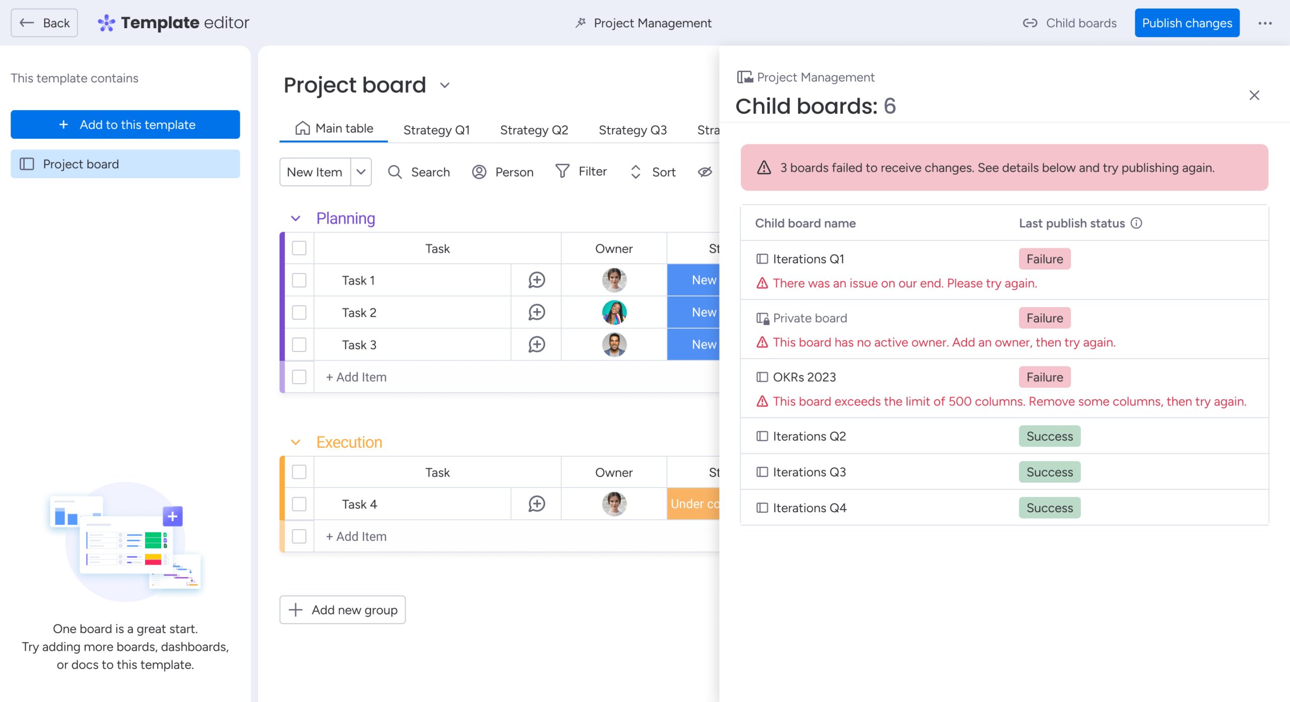
Later, we extended the system to support advanced use cases like publishing updates to child boards — complete with validation states.
Users see which boards updated and why
Results
- Usability score for the save flow increased from 1.75 to 4.5, based on two rounds of moderated testing
- The new system played a key role in securing a 250,000-seat enterprise deal — one of monday’s largest to date
- Design partners validated the direction early, with feedback like: “This is exactly what we wanted. When can we start using it?”
What I learned
Designing for enterprise isn’t about adding more options — it’s about making the right ones unmistakably clear.
- Clarity is the foundation for scale. Enterprise teams move fast when the mental model is simple, consistent, and obvious.
- Structural changes often outperform new features. Moving templates into their own space did more than a new capability could have.
- Language is product design. Copy, timing, and feedback loops shifted how users understood — and trusted — the system.
Thank you
Next Projects